
Boost conversion rates with these best practices for your CTA buttons
Your call to action (CTA) is a crucial part of any marketing touchpoint, be it your website, emails, or landing pages. It’s the final step that leads the user to take an action and convert into a lead or a customer. However, most businesses overlook the importance of the design and placement of their CTA buttons. In this blog post, we’ll discuss some best practices for creating effective CTA buttons that will increase your conversion rates.
Use a contrasting colour
One of the most important things to consider when designing your CTA buttons is the colour. Your buttons should stand out from the rest of your content and the background. Use a contrasting colour that will draw the user’s attention to the button, making it more likely that they will click on it.
Consider the user’s position in the marketing funnel
To create effective CTAs, you need to take into account where the user is in the marketing funnel. Are they at the top, middle, or bottom of the funnel? It’s important to tailor your CTAs to each stage of their journey to increase the likelihood of conversion. For example, at the bottom of the funnel, you might use a more direct and urgent CTA, while at the top of the funnel, you might use a softer CTA to entice the user to learn more about your product or service. You can include multiple CTA’s to appeal to different user journeys, but be clear about which is your primary CTA and don’t include too may – a primary and secondary call to action is usually plenty.
Use “I want to…” button text
The text on your CTA button should convey what the user will get by clicking it. Use the phrase “I want to…” and complete the sentence with a specific action. For example, “I want to book a demo,” “I want to download the free e-book,” etc.
Support your CTA with relevant copy
Your CTA button doesn’t have to stand alone. Use supporting copy that contextualizes its offer and addresses any barriers to conversion. For example, if your CTA is “Book a Demo,” you could include a small disclaimer-size line that says “Free 30-minute online demo – see how our product works.”
Inject urgency with a countdown timer
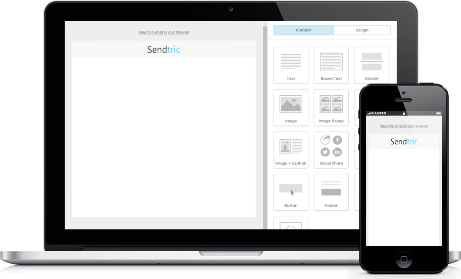
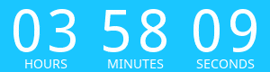
The human brain is wired to respond to urgency. By adding an element of urgency to your CTA, you’re more likely to get readers to take action. One way to add urgency is to use a countdown timer that shows when your offer expires. This will create a sense of FOMO (fear of missing out), driving users to take action before it’s too late. Try Sendtric’s free customisable countdown timer tool and generate bespoke countdown timers to support your CTA’s.
By using these best practices for your call to action buttons, you can increase your conversion rates and drive more leads and sales. Remember to use a contrasting colour, consider the user’s position in the marketing funnel, use “I want to…” button text, support your CTA with relevant copy, and inject some urgency. With a well-designed CTA button, you can turn your marketing into a powerful lead generation machine.
Add a Free HTML Countdown Timer
No watermark – Up to 10,000 views for FREE
Copy this code into your HTML email template.
- Fill out the form to the left with your desired countdown options
- Click Generate
- Copy and paste the provided code into your HTML email template
- Enjoy your FREE email countdown timer from Sendtric!